PROJECT OVERVIEW
CLIENT
DELIVERABLES
MY ROLE
TIME FRAME
THE CLIENT
The Gala Casino brand is one of the UK’s largest in online gaming and is part of the Ladbrokes Coral Group. Gala Casino.com provides online gaming products with a wide range of casino, live dealer, poker and other gaming experiences across different devices.
THE PROBLEM
The brand had multiple products for the same purpose but with inconsistent experiences across different devices. User research had shown the casino brand and products had little in substance which made them stand out from the competition. The products had lost their appeal and were struggling to gain loyalty or attract users with the old brand, design and user experience.
THE CHALLENGE
As a result GalaCasino.com was going though a brand re-position and required a fresh approach to their market leading products and customer experiences. Our aim was to provide a new innovative digital experience for the casino website as well as to communicate better with players to strenthen the brand reposition principles. The brand positioned this as the “What You Want” message which focused on tailoring to players needs – a user centred approach.
THE SOLUTION
The proposal was to deliver an all in one solution with a new responsive website. In order to meet the brand requirements we created a unique experience which was standout from industry competition. I looked at solutions outside our market space in particular to gain inspiration.
- Applying personalisation potential for users
- Establish a responsive strategy
- Fully responsive for maximum use of real estate
- Exercising user centred design to enhance user experience and interaction
- Simplifying the interface
- Implementing consistent journeys across devices
- Focusing on content first – Card systems to structure content better
- New interface design to move away from common visuals and outdated industry stereotypes
- Implementing intuitive design patterns
MY ROLE
I was the lead UX designer for this project. My role was to provide the UX solution for a responsive website from an array of outdated products and content. I was responsible for the team to deliver UX strategy, obtaining or conducting research and wireframe design.
I worked closely in a team with the Design Manager and UI lead. We were responsible for pitching, planning and producing the Gala Casino responsive website within a 2 month window.
BUSINESS OBJECTIVES
- Deliver an increase in acquisition of users
- Increase deposit journey conversions by over 10%
- Reduce bounce rates by over 4%
- Translate and communicate intuitively to all demographics
- Convert the independent desktop and mobile sites to a single responsive design solution
Scroll down to see more about this project
THE PROCESS
DISCOVER, DEFINE, DESIGN, TEST, DELIVER
The process diagram I adopted here clearly defines the what, how and when of each stage including iteration and testing.
I had to identify early on which stages i will be able to include by measuring if they are achievable in timescales, required for the product and useful for research goals. I put the less achievable stage tasks on the “bench” and re-open them if and when required.
In an ideal world I would like to work through as many process stages as possible but constraints and blockages for this project pressed me to be more astute with my choices.

UX Process diagram from Tiffanyho.co
DISCOVERY
PREVIOUS SITE REVIEW
It was critical to improve on the experiences we were re-designing. I carried out a heuristic review to discover how users accessed and experienced previous products and highlight issues. I divided the review into journeys, sections and scenarios. This provided me with criteria for which areas of the content, experience and design needed to be re-thought or adapted.
- Desktop, tablet and mobile sites were all separate designs and experiences – many different products for the same purpose – very confusing
- Too many levels within navigation structure
- Taxonomy was random and disorganised, labels missing resulting in actions with dead paths and journey failures
- Game filters in some sections worked well to reduce time in searching for games
- Search function not working correctly
-

Casino Products Critical Reviews
-

Research & Data Requirements
-

UX Improvements Wishlist


COMPETITOR REVIEW
We carried out a competitor review in order to better understand the market space and our competition within it. It exposed how competitors within this industry were all following very similar patterns in marketing, design and UX. We also reviewed our existing brand and marketing research on competitor positioning to gain an idea of the characteristics of each brand
- Many gaming sites looked and behaved very similarly
- Most competitors had the same games
- Interface look and feel had some brand differences but followed similar designs
- Lack of innovation from major competitors, Lacked personalisation
- Promotion heavy
EXPLORING OUTSIDE THE INDUSTRY FOR INSPIRATION
The main purpose of our products was for users to find games easily, quickly and informatively. In order to look for innovation we set about looking at products outside the industry with similar user goals. We looked at e-commerce sites to understand better navigation and search. We also looked at video streaming sites such as HULU, NETFLIX, Pinterest for filtering, layouts and cards.
Many of these sites were making maximum use of full screen layouts for better layout on RWD. The focus was clearly on content, showing simplicity and reducing noise for clearer communication such as using modular approaches with card designs.

UNDERSTANDING USERS
Within the team we had a very good understanding of who our users were but needed to better understand behaviours, habits and what they want. We structured the user research with the following methods:
Stakeholder User Insight
Working closely with stakeholders provided a valuable insight in to the behaviours and motivations of Gala Casino players
Analysing Existing Research
The business had recently conducted user studies for Gala Casino with a split on marketing and UX focus
Questionaires
Helped me understand what the users want to achieve, why they make certain choices and understand how they use the product
Usability Tests
To understand how our users behave and interact with the products
-

Demographics & Interests
-
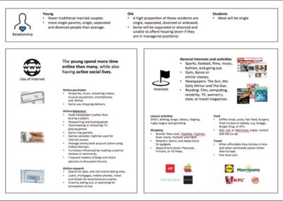
-

Creating Personas
-

Data lead Personas
-

Personas
-
Stakeholder Workshops


Discovery Stage Findings
Highlights & Findings
- Predominately male but a higher strike rate from females
- They like to play multi-channel
- They play a minimum of 8 games in a period – and are not restrictive to a single game type
- Interface was too busy – distracted from goals
- Users getting lost – difficult to find information
- Different products and experiences made for a confusing overall multi-channel experience
- Frustration at finding games
- Many players said we didnt stand out, nothing new from competitors
- Opted to play with us because of promos, offers, VIP status
- Some users don’t want to be entertained with new games, just focus on the same game
Objectives & Solutions
- Build a responsive with intuitive and user goal focused experience across all resolutions
- Build relationships with new customers though new design and UX
- Increase Gala Casino brand engagement and recognition through unique experience design
- More Promotions, more relevant promos, arriving at the right time when playing particular games (personalisation)
- Minimise cognitive load
- Add personalistaion elements
- Simplify the interface and journeys
- Reduce game search time – offer favourites, saved games etc
- Build a experience that has a story and creates recall
DEFINE
We designed a previous project called Gala Bingo with the intention of using its’ foundational structure on all gala products for consistency across the Gala brand portfolio. Adopting and adapting the foundational design structure would make the experience familiar and easier for cross brand players to use.
DEFINING JOURNEYS AND PAIN POINTS
We ran personas through goal and task based scenarios with stakeholders. The tasks were based on our research findings and business goals.
Our key goals and tasks are:
- Login
- Register
- Find a game
- Find a Promo
- Make a Deposit
- Make a Withdrawal
- How to play a previous game

We identified some pain points on our journeys and introduced some new personalisation features:
PAIN POINTS
Login and register would have to be re-designed to reduce drop offs.
We also had issues with how to find and access games, previously played games and promotions
PINS
We decided to introduce a feature which allow users to “Pin” games and promos which would appear on the homepage on a “Pins Board”. It was a innovative method to favouriting items and would allow us to push personalisation whilst differentiate from our competitors.
RECOMMENDATIONS
We also decided on a recommendations feature which would offer the user preferential games and promos at different levels depending on player history.
DEFINING STRUCTURES, SITEMAPS AND NAVIGATION
Defining Screen Resolution:
The current desktop version is 940px wide. After reviewing the most popular screen resolutions (1366, 1280, 1920) we decided the website should be 1200px width. This is a good average target size and will help us accommodate layout and content as well as better support a responsive solution. 1200px resolution would also allow us to not deviate too far from the current 940px width layout. From 1200px the site would be fluid up till 1600px wide. This gives us much flexibility and adapts well to large screen sizes.
Width X Height
Desktop: 1200px
Tablet Landscape: 1024px X 768px
Tablet Portrait: 768px X 1024px
Mobile Landscape: 480px X 320px
Mobile Portrait: 320px X 480px
-

Initial Sitemap X-Ref Screen Res
-
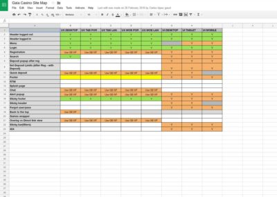
Initial Sitemap X-Ref Screen Res
-
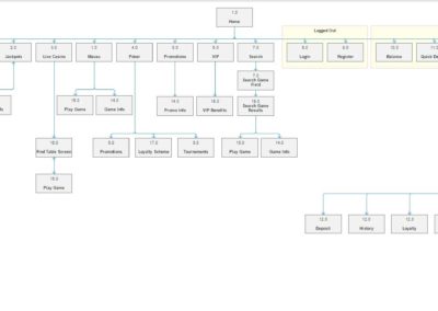
Initial Sitemap Structure


At this stage i wanted to establish some principles to implement in design from all the findings from our work.
- We had established a responsive strategy
- Fully responsive for maximum use of real estate
- Implementing consistent journeys across devices
- Focused on user centred design as oposed to a business and stakeholder led product
- Applying personalisation potential for users
DESIGN
As we had agreed on target screen sizes for design purposes, i thought it was time to start designing the framework foundation via sketches and detailed wireframes. I designed the UX wireframes for the whole site with responsive interpretations for each screen. These wires were to be sent to developers with detailed documentation of navigation, functions, UX patterns, interactions etc for reference during their development process.
DESIGN HIGHLIGHTS
Grid System:
Like all successful design and development projects the foundation of our design is based on a grid system. Grids allow clarity, order, efficiency and consistency. For our UX and UI we based the site on a 12-column grid system which has allowed us to tackle design, usability and consistency with any responsive issues.
Navigation:
The original desktop navigation would be overhauled as it lacked clarity and added confusion. The main site navigation would be updated to a new design with left and right side split. The left side wiill contain all of the main site sections. The right side contains login, join now and when logged in would contain Cashier, Balance, My Account and Quick Deposit.

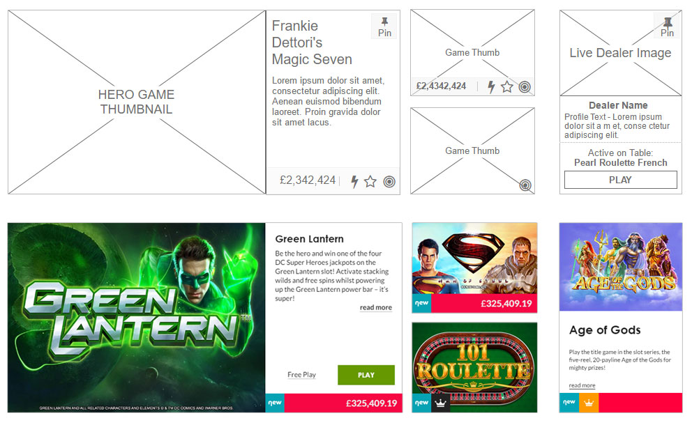
Cards & Tiles System:
We wanted to apply a content first approach and present information in a coherent and clear order. I decided to use a card and tile system to display images, text, games etc. Cards and tiles are perfect for mobile devices as well and with the future push on mobile device gaming we wanted to future proof a system. Cards divide content into meaningful sections which occupies less screen space as well as allowing users to scan and digest information easier.
Tab Sections:
Many sections contain sub sections. Rather than create a separate page for each sub-section we implemented tabbing. A page can lead with a banner and below would follow tabbed headers for all the subsections. This allows the user with constant access to the main navigation and sub navigations, as they will be visible at all times. Tabs also are easy to select, take up little space and explain where a user is as well as where they can go. Tabbing also allows us to connect a filter system (where required) to the associated active tab in an intuitive method for the user.
At mobile resolutions the tabs will automatically convert to an accordion menu system. This will provide the user with full visibility of menu items on a small screen size.

Pins:
The “Pin” feature allow users to “Pin” games and promos which then appear on the homepage on a “Pins Board”. Users have constant access to their pinned items on the homepage and all top level sections

My Account Deposit:
From my e-commerce experience and our user research I found users wanted complete focus when it came to handling money i.e. paying, depositing and withdrawing. Coupled with a easy to use experience our My Account had to provide users with a sense of security. I reworked the My acount section to match the tried and tested Gala Bingo structure. The new My account section simplifies each section and has its own dedicated space without any distraction from other parts of the site.
TEST – DELIVER
USABILITY TEST
I strongly believe testing with users is one of the most valued and comprehensive methods in which to measure and learn about users and products. We carried out usability tests on prototypes and beta versions of the responsive site. Testing the product out on user groups was fundemental in understanding positive and negative behaviours as well as cognitive processes.
Some highlights of usability testing:
- Hugely positive feedback on design
- Easy to navigate
- Require quick access to all types of balances
- Users want to select PINS in filter option
- Allow for similar games on Game Info Screen
- Signposting missing on some sections
After making ammendments we delivered the product with very positive feedback from our users and the industry as a whole.
Our users found the experience original and exciting with the new design and UX. We also had positive feedback for mobile and tablet versions with many users surprised at the consistency in expoerinces making for an intuitive and easy to use experience.
RESULTS
The Results Were Amazing!
20 weeks after launch we had increasingly promising results from our responsive website.
12%
Increase in acquisition of users
16%
Increase in Deposit Journey Conversions
4%
Reduction in Bounce Rates
Greatly Improved User Satistfaction
Other Projects